

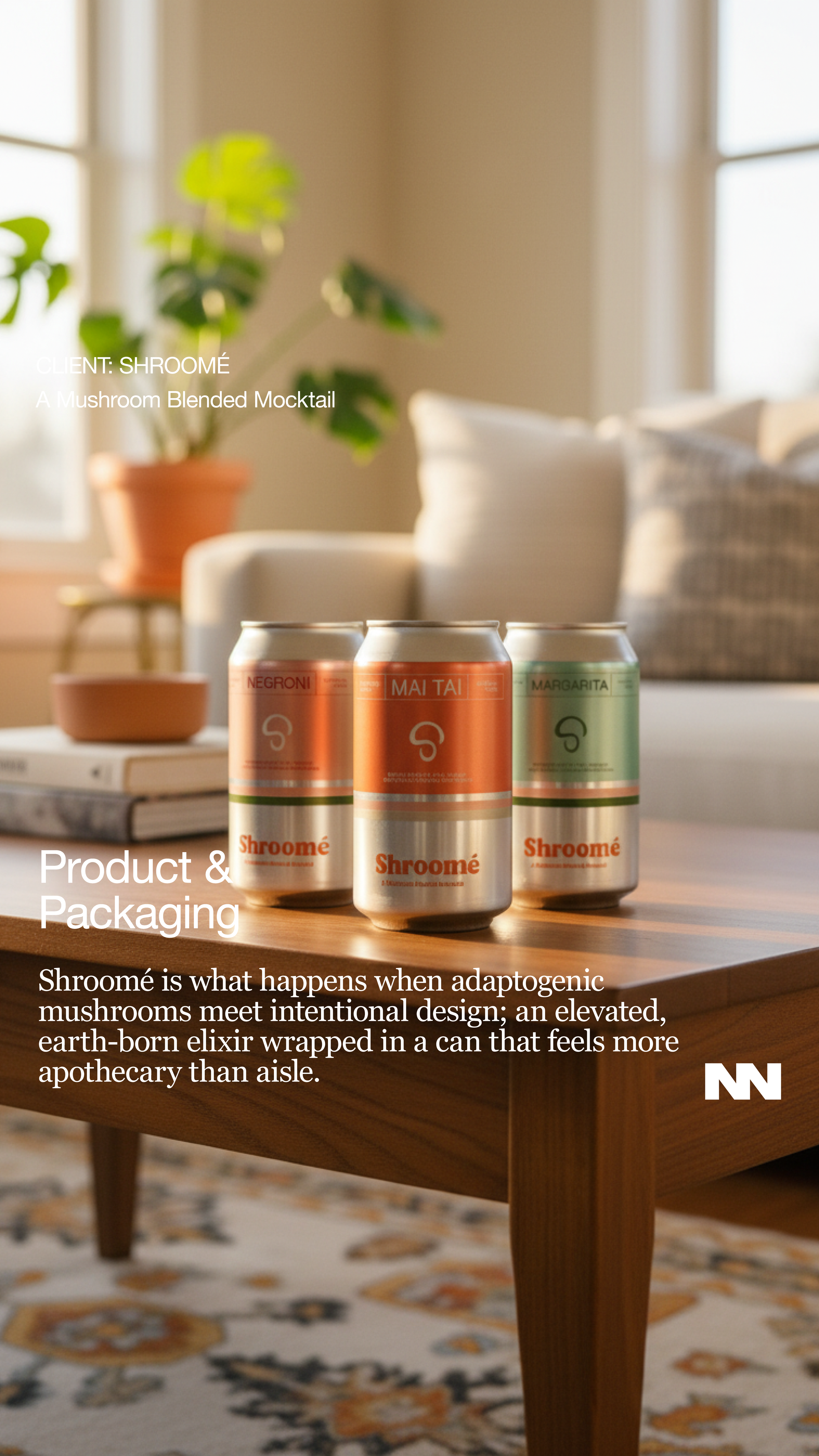
Shroomé
Branding
Highlight
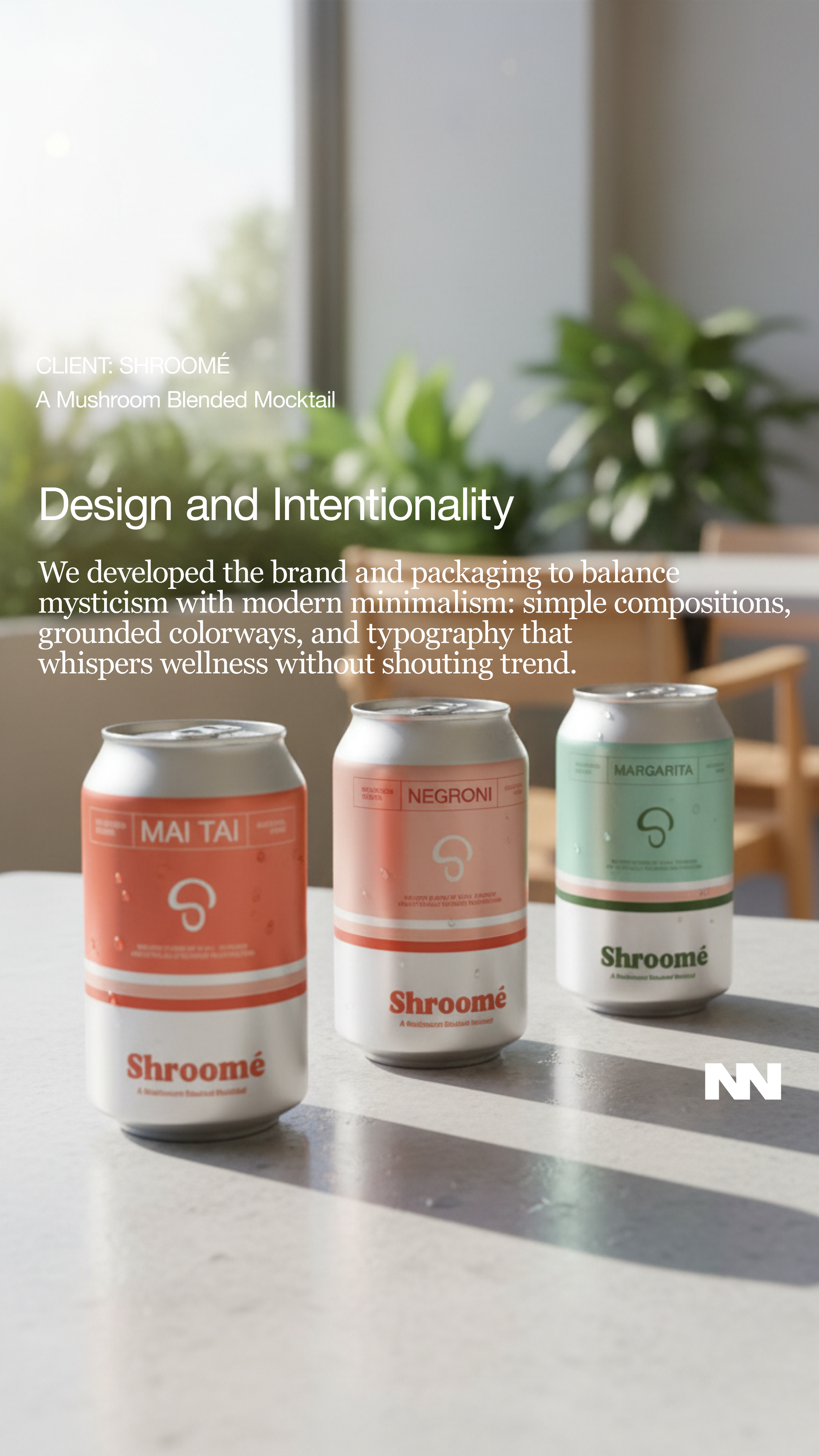
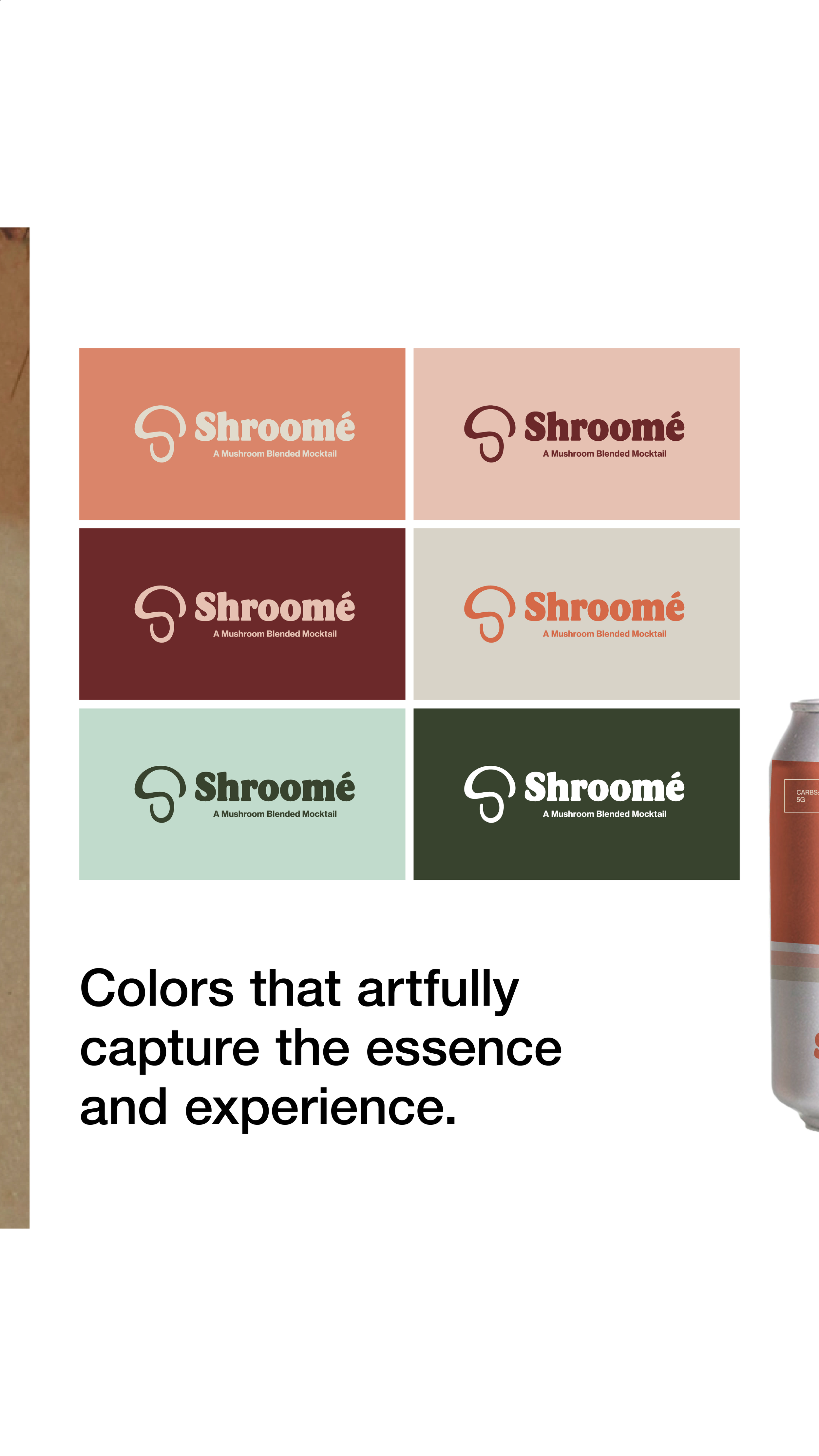
Complete brand guidelines development for SHROOMÉ. We established a cohesive visual identity system including logo usage, typography, color palettes, imagery standards, packaging and brand voice. These guidelines ensure consistent brand expression across all touchpoints, empowering the team to maintain brand integrity as they grow.


Shroomé was never approached as a “brand” in the conventional sense; it was treated as a controlled study in perception. We began with the premise that mushroom-based consumption already carries cultural residue, earthy, mystical, occasionally suspect, and asked how far that narrative could be abstracted without losing its biochemical intrigue. Our methodology prioritized reduction over expression: stripping visual language down to its most precise signals, then reintroducing tension through contrast, pacing, and restraint. Every decision was subjected to a kind of aesthetic peer review: does it communicate function, does it provoke curiosity, does it resist cliché. If it failed even one metric, it was eliminated.


The resulting system is less about identity and more about calibration. We weren’t interested in making something “beautiful” so much as making something inevitable, an outcome that feels discovered rather than designed. This meant working in micro-adjustments: typographic pressure, spatial rhythm, the exact temperature of color. The process was iterative to the point of obsession, but never indulgent; intuition was allowed, but only after it could justify itself. What emerges is a visual language that doesn’t explain Shroomé, it regulates how it’s perceived, with just enough ambiguity to let the audience complete the circuit.