A-Sha
88 Rising Night Market
° PROJECT OVERVIEW
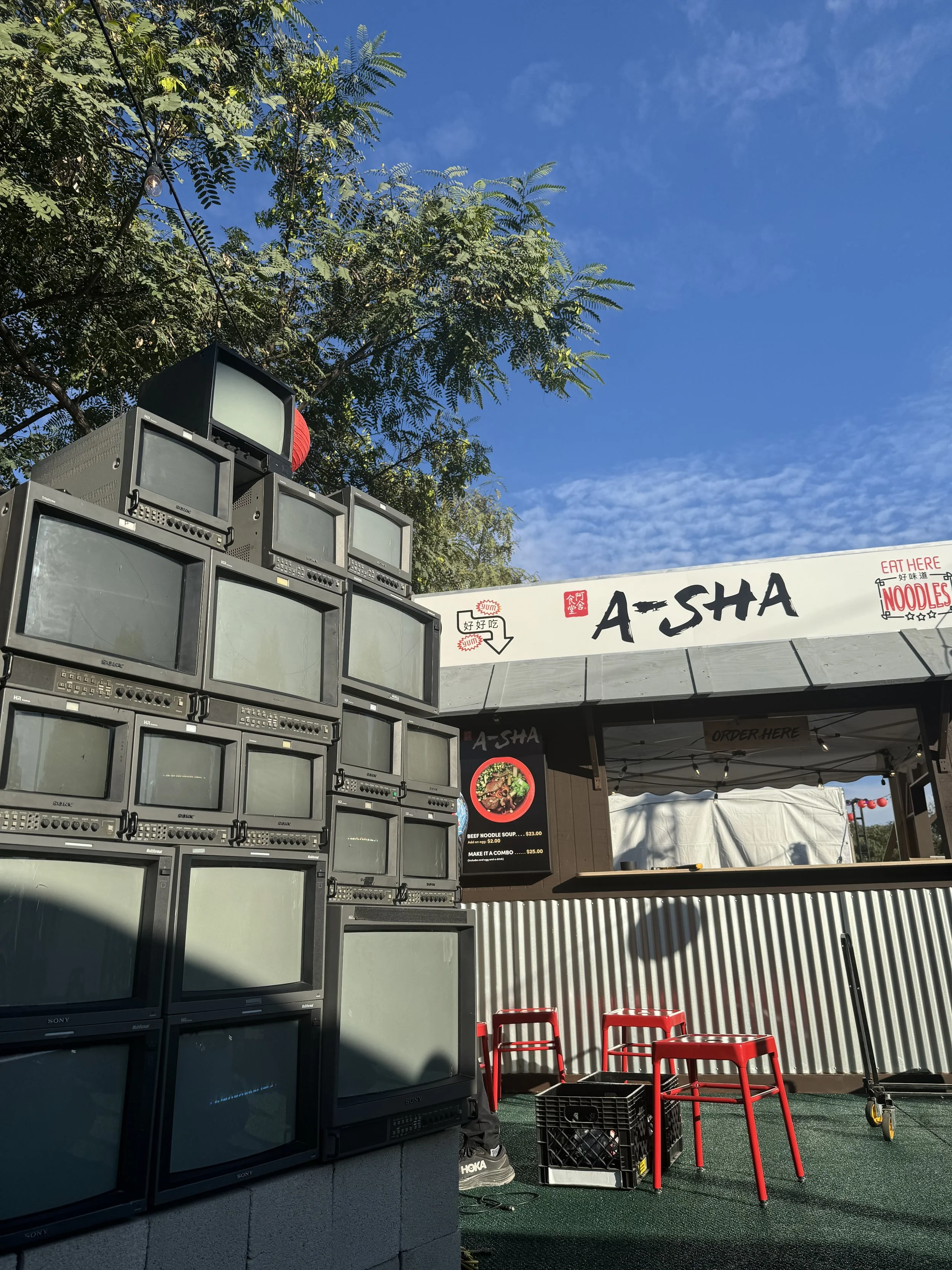
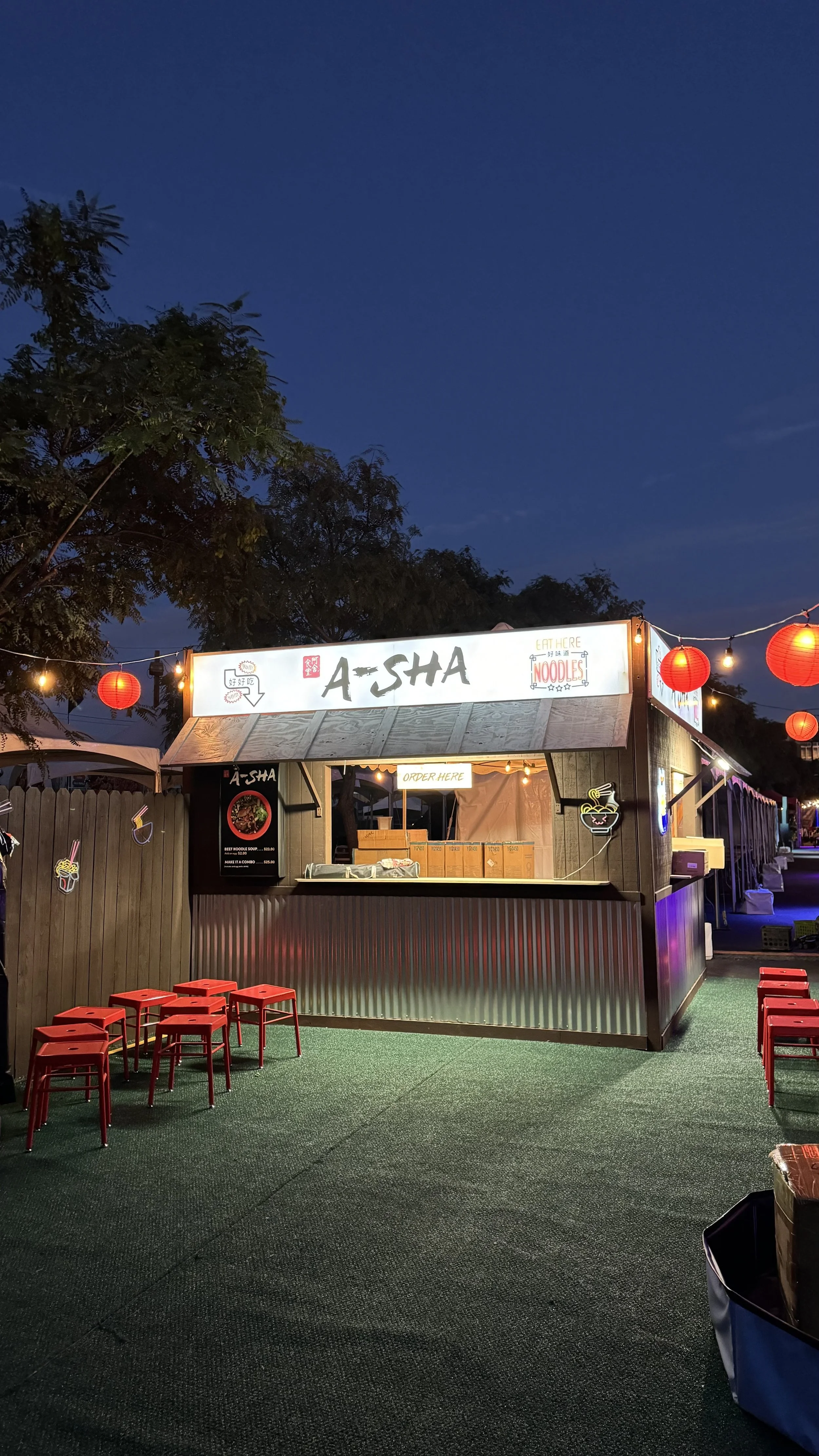
From initial 3D modeling to full fabrication, we delivered a turnkey booth solution for A-SHA. Our team handled every phase: conceptual design and rendering, complete buildout and installation, on-site breakdown, and secure storage. This comprehensive approach ensured a stunning brand presence with seamless execution from top to bottom.
° CONCEPTUALIZATION
Nnovate Studios approached the All About the Bread brand system as a study in restraint, precision, and sensory hierarchy—an exercise in elevating flour, water, and time into a coded visual language. Typography balances austerity with warmth; a calibrated serif carries quiet authority while negative space performs as an active ingredient rather than absence. Color operates within a disciplined spectrum - baked neutrals, fermented golds - engineered for consistency across packaging, digital surfaces, and spatial touchpoints. Guidelines articulate a controlled elasticity, allowing expression without dilution of identity. In short, a brand architecture designed to feel inevitable, yet just a little indulgent.
° PRODUCTION
Nnovate Studios approached the All About the Bread brand system as a study in restraint, precision, and sensory hierarchy—an exercise in elevating flour, water, and time into a coded visual language. Typography balances austerity with warmth; a calibrated serif carries quiet authority while negative space performs as an active ingredient rather than absence. Color operates within a disciplined spectrum - baked neutrals, fermented golds - engineered for consistency across packaging, digital surfaces, and spatial touchpoints. Guidelines articulate a controlled elasticity, allowing expression without dilution of identity. In short, a brand architecture designed to feel inevitable, yet just a little indulgent.
° EVENT
Nnovate Studios approached the All About the Bread brand system as a study in restraint, precision, and sensory hierarchy—an exercise in elevating flour, water, and time into a coded visual language. Typography balances austerity with warmth; a calibrated serif carries quiet authority while negative space performs as an active ingredient rather than absence. Color operates within a disciplined spectrum - baked neutrals, fermented golds - engineered for consistency across packaging, digital surfaces, and spatial touchpoints. Guidelines articulate a controlled elasticity, allowing expression without dilution of identity. In short, a brand architecture designed to feel inevitable, yet just a little indulgent.